We kindly inform you that, as long as the subject affiliation of our 300.000+ articles is in progress, you might get unsufficient or no results on your third level or second level search. In this case, please broaden your search criteria.
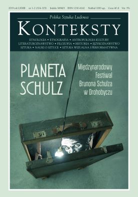
This article deals with “Professor Arendt” – one of the protagonists of Sklepy cynamonowe (The Cinnamon Shops) by Bruno Schulz. Władysław Panas indicates that the Professor is not only a specially distinguished dramatis persona within the construction plan of the story but also an exceptional character in entire Schulzian prose, since he is the only mentioned by name whom Schulz transferred into his prose from the actual reality of Drohobycz. The first part of the article presents historical-biographical findings concerning Adolf Arendt – a teacher of drawing at the Drohobycz secondary school. Władysław Panas goes on to present an interpretation passage placing Professor Arendt against a wide backdrop of “nocturnal painting” and “graphic nocturnes”; by making use of of the strategy of “anagrammatical-hypergrammatical” analysis (inspired by notes by Ferdinand de Saussure on anagrams, anaphones, and hypergrams) he shows the structural relation between Arendt and Rembrandt and – more extensively – links the manner in which Schulz comprehended art and the vision of art present in his oeuvre.
More...
The article discusses and characterises the manner of perceiving Drohobycz inscribed in the works of Bruno Schulz. Małgorzata Kitowska-Łysiak recalls that the home town of the author of Sklepy cynamonowe (The Cinnamon Shops) plays a key role in his imaginarium, while the focus accepted by the artist is the reason why in his literary and visual art works Drohobycz appears as a “concrete place on Earth” (with recognisable topographic and architectural elements of reality) and, at the same time, as a space of creative imagination. It is precisely the latter – as the author of the article demonstrates - that processes the visible world and deprives it of reality, additionally placing upon its objective reality a filter of individualised sensitivity while, at the same time, reaching the real subsoil of visible reality, its invisible “bastion”. According to the interpretation proposed by the article the perception of Drohobycz suggested by Schulz possesses its imperceptible antecedents in the impact exerted by the spiritual and artistic aura of a town that co-created the culturally diverse milieu of painters connected with Drohobycz - widely portrayed by the author - and in various ways conceiving its iconographic “form of existence” (i.e. Leopolski, the Gottliebs, Lilien, Weingart, Stupnicki, and Lachowicz).
More...
Excerpts of conversations and notes dedicated to Bruno Schulz by Ihor Meniok, co-founder of the International Bruno Schulz Festival in Drohobych.
More...
The article concerns “Bianka’s residence” – an important construction element of Wiosna (Spring), a story by Bruno Schulz and, simultaneously, one of the most prominent elements of this artist’s imaginarium. Władysław Panas analyses and interprets the “Bianka’s villa” motif, its structural and semiotic properties and inner-textual determinants, as well as those contexts belonging to it whose impact models to the greatest extent the semantic potential of the motif subjected to analysis. The crucial role in the research and reading strategy chosen by Panas is played by references to painting and - indirectly – to the reality of Drohobycz; the leitmotif of the presented deciphering is the multi-form presence in the story of “whiteness” (spanning from “whiteness” inscribed in the name: ”Bianka” to the iconic-chromatic value of “white” elements of the depicted world in Wiosna).
More...
Tragically, Bruno Schulz died before he could draw artistic conclusions from the cruel hunt known to history – and whose victim he became. On the other hand, it is a good thing that his pre-catastrophe writings allow us to better comprehend just how radical was this tragedy. The visual material at present at our disposal – the food for our imagination and school aids, which could make it easier for us to understand the nature of life in shtetls scattered across provincial Poland – is extremely modest. As a rule it involves only black-and-white photographs showing poverty, emaciated horses pulling primitive carts, old women wrapped in scarves and shawls, humble and, as a rule, wooden houses or cottages, geese condemned to death and carried to markets, barefoot children running and playing in sand or mud, and old men resting on benches. Sometimes, there are also brief snatches of a documentary film. Was Drohobycz too the site of geese, scraggy horses, and carts? Probably. Did Drohobycz differ from other small towns? Perhaps not. Schulz’s prose does not transpire exclusively in Drohobycz but in all the places of residence of more and less pious Jews. This is by no means a black-and-white prose.
More...
Did Schulz belong to a certain milieu, which concentrated the strivings of a group of artists working in a certain delineated geographical region? Portraits and self-portraits, illustrations to own stories, drawn sketches to unwritten prose, notes marked with erotica – those vividly differentiated formulas of artistic expression do not facilitate the research pursued by critics. Apparently, Schulz found it less of an effort to create visual-art works than to write. Nonetheless, this does not signify universal triumph and recognition; to the last days of his creative life Schulz, already an acknowledged man of letters, cherished unfulfilled hope for artistic success. Upon numerous occasions he expressed regret that he was incapable of mastering the art of woodcutting. As a graphic artist, illustrator, and draughtsman he concentrated on his world of the imagination and tended to avoid participating in programme disputes. In the course of several decades there appeared numerous publications analysing Bruno Schulz’s attitude towards art. In Poland interesting interpretations were offered by Jerzy Ficowski, Małgorzata Kitowska-łysiak, Krystyna Kulig-Janarek, and Irena Kossowska and in France by Serge Fauchereau. In this essay Marek Tomaszewski wishes to delve into the character of Bruno Schulz’s artistic debut as a graphic artist and draughtsman within the range of a local milieu typical for ethnic and cultural differentiation, as well as to follow his artistic path and wide gamut of social life connections. It is a known fact that Schulz’s artistic Modernism assumed form, i.a. under the impact of East European Jewish avant-gardes, which could have won the recognition of the debuting artist from Drohobycz. Who were the artists with whom Bruno Schulz exhibited his graphic artworks? What is the relation between this period of strenuous although much censored (in the case of Schulz) artistic activity and reviews written by the author of Sklepy cynamonowe in “Przegląd Podkarpacia” at the end of the 1930s, dealing with such artists as Ephraim Moses Lilien or Feliks Lachowicz? Who belonged to the closest group of Schulz’s artist friends? In this essay Marek Tomaszewski attempts to resolve precisely those and other questions.
More...
An attempt at an analysis of Schulz’s prose in a manner accepted in women’s studies and with the application of categories used in analyses of this sort. Such an approach calls for focusing on women, their experiences, and viewpoints. In addition, the analysis demonstrates primarily that in Schulzian stories women do not exist as independent subjects but are described exclusively from a man’s vantage point (the “male gaze” category) as well as from the perspective of their sexual attraction, clothes, and appearance (including a “fragmentarisation” of the female body). Such marginalisation of women and their experiences is the outcome of the then prevailing culture, while fragments of Wiosna (Spring) indicate that Schulz was aware of cultural violence present in women’s socialisation and experiences. A dominating part of his prose contains a reflection of the small-town patriarchal world in which women were not the partners of men but persons granted a subjective, subordinate, and marginal social position. Their absence as independent subjects points to “symbolic annihilation”, described in studies on gender inequality, which consists of ignoring or at the very least belittling not merely the role, experiences, and viewpoint of women but even their social presence.
More...
The article deals with the creative teamwork of writer Elin Pelin and painter/ cartoonist Alexander Bozhinov, under consideration here as a children’s book illustrator. Bozhinov’s career of an illustrator began as early as 1899, when he illustrated The Earliest Collection of Stories and Fairy Tales for Childrento continue in the early 1920s with the emblematic books An Alphabet for the Youngest (1921) and A Golden Book for Our Children (1921) that set visual codes to Bulgarian children’s book illustrations influenced by the native art and the Secession. The next worthy books for children he illustrated were Elin Pelin’s The Three Grannies (1926); Pellucid Streamlets (1931); Grandpa’s Mitten (1937); The Big Bad Wolf (1956). These books left an indelible imprint on Bulgarian children’s literature not only owing to the profoundly merry and contagious humour, shown both by the author and the artist, but also to the quality of the illustrations, which became a favoured reading of generations of Bulgarian kids. The article gives the reasons for the success of this author/illustrator team, rooted in their earlier teamwork contribution to the satirical Bulgaran weekly (1904–1909), their love for children’s readerships, whom they offered their wisdom, ethics and life experience without lecturing or preaching, their attitude toward Bulgarian villagers, who had become invariable characters of their children’s book, etc. At the same time, Bozhinov’s formal methods and approaches to children’s illustrations, stylistic influences and the highest point of Bozhinov’s illustration style are analysed. Modern without being a modernist, Alexander Bozhinov has forever become a canonical figure in the national culture that the next generations could only use as a springboard or humbly follow in his footsteps.
More...
The article focuses on artist Mincho Nikiforov and his illustrations for the children’s novel in two parts, Yan Bibian. The Fantastic Adventures of a Kid and Yan Bibian on the Moon, by canonical Bulgarian writer Elin Pelin. The lack of equal footing between word and image is pointed out, both in a historical context and today’s Bulgaria. The popular fictional character, Yan Bibian had not a clear-cut and recognisable visual equivalent. Some details of the artist’s life are adduced using a form of the Union of Bulgarian Artists he himself has filled in. His participation in exhibitions of paintings and first of all, his work in the field of printing industry are mentioned. Mincho Nikiforov was active in the 1930s as an illustrator and designer of textbooks, books and periodicals mostly for children. Facts of Elin Pelin’s activity and typical specifics of his style are reminded with a view to publications for children. The context of the strong development of publishing of children’s books and periodicals in that decade is extended to focus on a number of factors such as the governmental policy, economic conditions, the upsurge in the activities of private publishing houses, increased consumption related to the development of the educational system, etc. The role of Hemus press in these processes is defined. The history of Puteka (Path) newspaper for children and adolescents has been reconstructed, where Yan Bibian was first published as a serial. The earliest illustrations for the novel and Mincho Nikiforov’s style are briefly analysed.
More...
After the end of WWI, printing in this country grew significantly. As early as the beginning of the 1920s, printing works had been publishing a large number of books for children, which gave a strong impetus to the development of Bulgaria’s children’s illustrations. Such artists as Boris Angelushev, Georgi Atanasov, Nikola Tuszuzov, Ilia Beshkov, Vadim Lazarkevich, Alexander Bozhinov, Raiko Alexiev among many others, contributed greatly towards the radical change in this genre and it was owing to their achievements that Bulgarian publishers received many international awards at the turn of the 1930s. Several female illustrators also made a name for themselves in this genre in the interwar period: Donka Konstantinova, Eli Dobreva, Masha Zivkova-Uzunova, Nevena Tuszuzova, Vera Lukova and Binka Vazova. As early as the beginning of the 1920s, some of them made their first attempts in the entirely new to them children’s illustration. To many of the female artists, the two interwar decades were a period of an intense creative activity. They participated actively in the artistic life of this country as members of all professional associations; uniting in their own organisation, making remarkable works in the field of painting, sculpture and graphic arts and categorically establishing themselves in the field of applied arts. Their sporadic achievements in children’s illustrations are now of particular importance to the historians of Bulgarian art, taking into account that from the early 1930s onward, many Bulgarian artists took to working in narrowly limited areas of fine arts.
More...
The article deals with the initial idea and its visual rendition in the fairy story The Prince and the Plague (1931) by Nikolai Rainov. This fairytale is among the author’s most ingenious works. The story treats a philosophical problem the writer has been concerned with for years, i.e. that of good and evil, synthesized here into the issue of power and how it affects human mind and mentality. Unique in its content, the book combines two of Rainov’s métiers as a writer and an artist. Unknown letters to and by Nikolai Rainov are cited relating to this fairytale, some of them published for the first time. These shed light on the artist’s initial ideas of the design of the book: illustrations, size and font, as well as on the ensuing changes in the book. The article also considers the Serbian version of the story, The Tsarevich (1938), translated by writer, journalist and translator Siniša Paunović, Nikolai Rainov’s contemporary and friend. The Serbian edition evidenced the interest in The Prince and the Plague shown abroad and is important to the cultural exchange and research on Bulgarian-Serbian relations of that period. Special attention is drawn to 12 found original colour illustrations, a small part of the total of illustrations included in the book. This is their first presentation and publication, being considered in parallel to the content of the text and the images, obtained in the black and white printing. A stylistic and iconographic analysis compares them to examples of the Secession, revealing parallels with the work of English illustrator Aubrey Beardsley. A versatile artist, Nikolai Rainov sucsucceeded in achieving the decorative not in the text alone by using various specific literary devices, but also in the illustrations, where stylisation is leading. The latter are interpreted as a second text enriching the story. Owing to the organisation of the overall design and well-devised technical specs of the book such as the coordination of the font, format, jacket, cover, margins, illustrations, the decorative-pictorial and textual-representational are in perfect sync.
More...
As musicians, we find it beneficial to research the meanings of music as reflected in Patristics. This study is a reminder that music has a divine role, and that it is important to never forget that the sonorous art has always been used as praise. Starting from the importance of music in the Holy Bible, we will discuss the place of music in Patristic texts. For a meaningful musical life, we believe that it is our duty to read and deepen the ideas put forward by the Church Fathers about the way music has to be merged with faith.
More...
In the article, the author focuses on the cinema on the imperial past of Russia, which in the 21st century is actively supported by the current authorities of this country. In the first part of the text the author refers to film examples from the 1990s and the first decade of the 21st century referring to the imperial theme, proving that the medium of film has gradually become an instrument of Russian historical policy, which boils down to rebuilding the myth of “Great Russia”. The intensifying imperialist tendencies are a symptom of an ideological and identity crisis that has been updated during the political transformation in the early 1990s and continues in a modified form to this day. The second part of the text is the analysis of the reception of the film „Mathilde” (dir. Aleksey Uchitel, 2017). The reaction of representatives of the authorities and part of Russian society to this film testifies to the crisis of Russian ideology and the spread of autocracy, which in the future may lead to the dismantling of the Russian state.
More...
The article discusses Bulgarian artists’ views of the world practices in illustration of children’s books and their participations in international exhibitions. In the Cold War, many new and traditional art forums were developed and maintained with the idea of mediating communication in the field of culture. Among them were book fairs and exhibitions held in Frankfurt, Leipzig, Bologna, Bratislava, Moscow and elsewhere. Children’s editions were thought of as a ground particularly conducive to the exchange of cultural experiences. In this most general context, children’s books from Bulgaria travelled and appeared on the shelves next to books created in the ‘world at large’. Artists also travelled to attend book fairs and exhibitions. In the 1960s, talented artists of the younger generation such as Luben Zidarov, Ivan Kiosev, Ivan Kirkov, Borislav Stoev among many others, brought about a revival in the field of children’s books in conditions of support by the communist authorities for that field. Bulgarian artists conceived and practiced the illustration of books for children and adolescents in a creative partnership with the literary text. In terms of form and style, they had a variety of authorial choices and skills: pictorial and graphic, in the area of the graphic print or its imitation; relief printing (woodcut, linen) or intaglio printing (etching, dry needle); references to children’s drawings, etc. These qualities of the book illustrations for children and adolescents in Bulgaria under communism are the reason for our present interest. Yet, there were many difficulties facing the realisation of books outside Bulgaria. In the West, book fairs were venues for signing contracts with publishers. In the so-called Eastern Bloc, publishers had no autonomy, as in the West. The management of their activities was centralised. Books by Bulgarian authors could be exported only if translated. On the other hand, many well-illustrated and designed children’s books were translated from foreign languages. In addition, the poor quality of the materials and the print did not allow the skills and talent of the artists to manifest themselves and to be realised on an international level.
More...
After the peak of the Bulgarian illustration in the 1960s and 1970s, the same familiar direction was followed in the next decade. The main illustration trendsetter was the traditional National Exhibition of Illustration and Book Arts and the annual Best Book Competition. Naturally, artists continued their creative quests, each of them finding their own way of expressing their personal creativity, whether complying with the literary text or not, sticking to their recognisable styles or inventing innovative ones depending on the particular project. This trend in the 1980s exhibitions failed to produce good examples of the art of book illustration, but rather demonstrated the best achievements. In children’s illustrations, authors had a much wider artistic freedom depending on the age group, the text or their personal creativity, than the illustrators working in the field of poetry and fiction. The artistic attitude towards the children’s world of fairytales, the folklore and traditional elements, and even co-authorship with the text, shaped the wide spectrum of this category in the exhibitions to their very end in the early 1990s. Despite the huge artistic experience of Bulgarian illustrators, their development, however, faced a number of obstacles such as bad print, planned publishing, the growing financial crisis, which led to a lack of paper, inks and production constraints. Criticism also often lapsed into a ‘helpless’ situation drawing the same conclusions and making rather too literal-minded comments on issues that had not been solved by either the artists or publishers and printers. The end of the decade and the end of the political system in this country brought to an end the exhibitions and competitions, which would never be renewed.
More...
An attempt at a reconstruction of the fate of two witnesses of the life of Bruno Schulz: the Drohobycz lawyers Michał Chajes and Izydor Friedman (after the war: Tadeusz Lubowiecki). Their reminiscences and accounts served Jerzy Ficowski writing about Schulz – the author of this study, however, indicates that they were treated in a rather selective manner. Jerzy Kandziora demonstrated that both men “played a particularly great role in the early formation of Ficowski’s knowledge about Schulz and provided him with very copious characteristics of the man of letters […]. Paradoxically, these were persons who in the main text of Regiony wielkiej herezji never appeared as authors of such extensive source accounts”.
More...
The proximity of Lwów (today: Lviv), an important centre of scientific life, became the reason why Drohobycz (today: Drohobych) found itself early on within the range of the interests of archaeologists, conservators of historical monuments, and historians of architecture. The regaining of independence by Poland in 1918 created new conditions for the protection of historical monuments. The Uniate church of St. yur in Drohobycz was recognised as an important monument in the Lwów conservation regiom, particularly in view of growing interest in wooden churches regarded as typical architecture in this part of the Second Republic. On 23 March 1934 the church was listed in a register of historical monuments. An essential role in the protection of historical monuments in the Second Republic was played by the Central Office for Art Monument Inventories (CBI), which conducted a planned and systematic inventory campaign across the entire Republic. CBI devised a model of “catalogue cards” containing administrative-historical data and a description of the given historical object for the purpose of recording historical monuments and a planned publication series of a topographic catalogue of art monuments. The cards in question included also one dealing with the church of St. Yur. The description on the catalogue card was based on own-observation familiarity with the object in contrast to earlier used questionnaires. A list of images, i.e. photographic plates and/or prints as well as architectonic-measurement photographs constituted another integral element of the card. The discussed catalogue card of the church of St. Yur is an important and heretofore incompletely exploited source of knowledge about this prominent monument of wooden architecture.
More...
The article looks at the practices, expectations and desires developed around Cuban dance, by focusing on the transnational circulation of Cuban dance forms and on dance instruction aimed at foreign audiences. Tourist encounters that take place at informal dance events and parties facilitate the emergence and diversification of narratives around racialized and gendered bodies, while emphasizing the inequalities of international tourism. The article is based on fieldwork conducted in Havana from March to May 2018.
More...